If you have ever looked at an ombre stamped image and thought, “Okay, how is that so smooth?”, let me pull up a chair at the craft table with you. Ombre stamping is one of those techniques that looks fancy, but it is really just a series of small, gentle steps. Sponge daubers make it especially friendly because you can place ink exactly where you want it and blend right on the stamp without committing to a messy ink smooshing situation.
In this tutorial, I will show you how to blend multiple ink colors directly on rubber or clear stamps using sponge daubers so your gradient looks soft and intentional, not striped or blotchy.
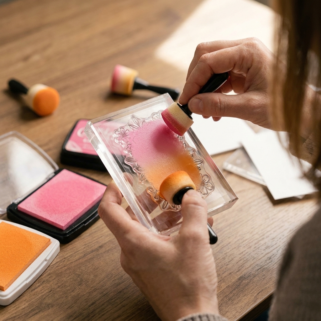
What makes ombre look smooth
A flawless ombre is all about overlap and control. You want each color to fade into the next with no hard “edge” where one ink ends and the other begins.
- Overlap zone: a small area where you apply both colors lightly so they can mix.
- Light pressure: daubers can deposit a lot of ink quickly. Gentle tapping builds color without splotches.
- Working from light to dark: it is easier to deepen color than to remove it.
- A good stamping surface: a slightly cushy mat helps the image stamp evenly, which keeps the gradient consistent.
Supplies to grab
You do not need a mountain of products for this, but the right basics make the learning curve so much nicer.
- Stamp: solid images, silhouettes, large sentiments, florals, leaves, backgrounds, and bold shapes are all great. (Super fine line art can work, it just will not show the ombre as dramatically.)
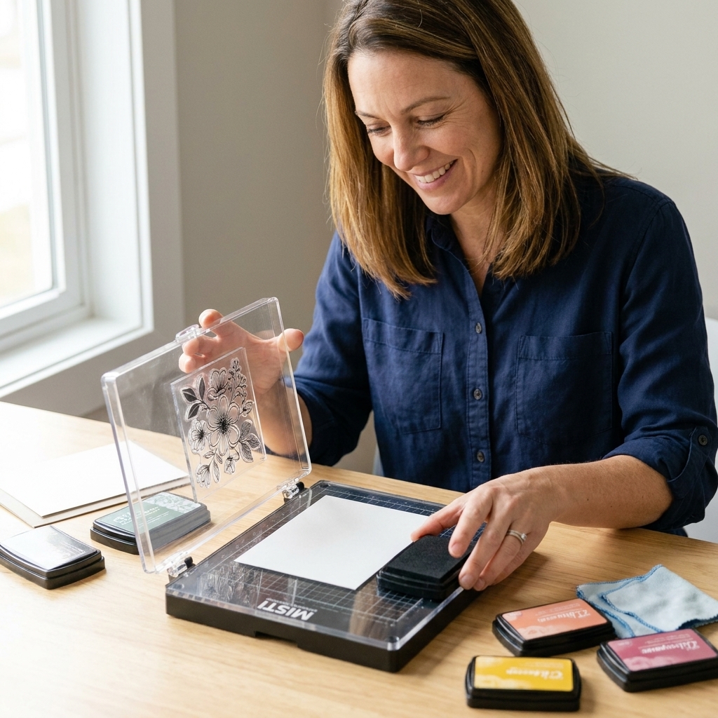
- Acrylic block or stamp positioning tool: a positioner is wonderful for re-stamping if needed.
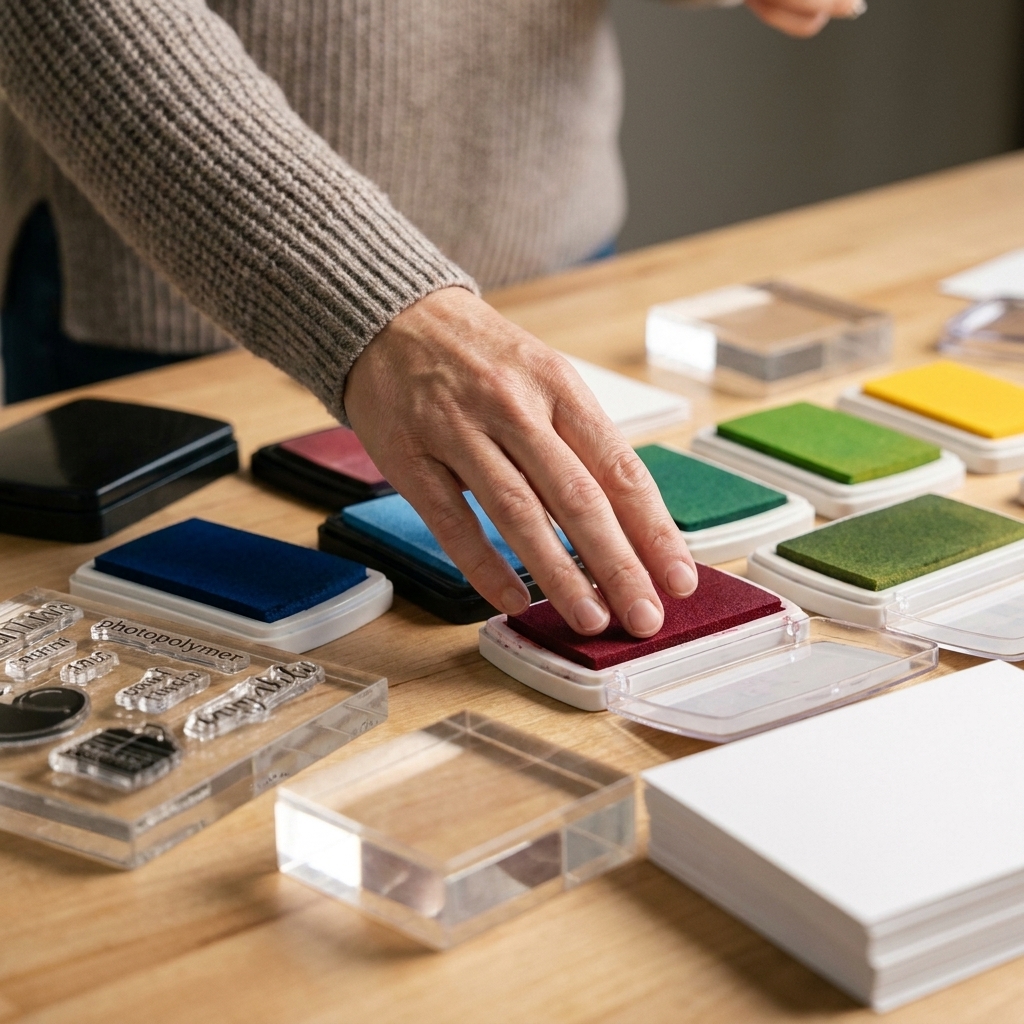
- Inks: dye inks blend beautifully for ombre. Pigment inks can work but tend to sit wetter and take longer to dry. Hybrid inks vary by brand, so do a quick test stamp if you are not sure how yours blends.
- Sponge daubers: ideally one per color family to keep your inks clean.
- Cardstock: smooth white gives the cleanest blend. Colored cardstock can be gorgeous too, just test first.
- Stamping mat or foam pad: for crisp, even contact, especially with clear stamps.
- Scrap paper: for a quick “first impression” test stamp.
- Optional: anti-static powder tool (if heat embossing after), a lint-free cloth for quick cleanup, and a stamp cleaner.
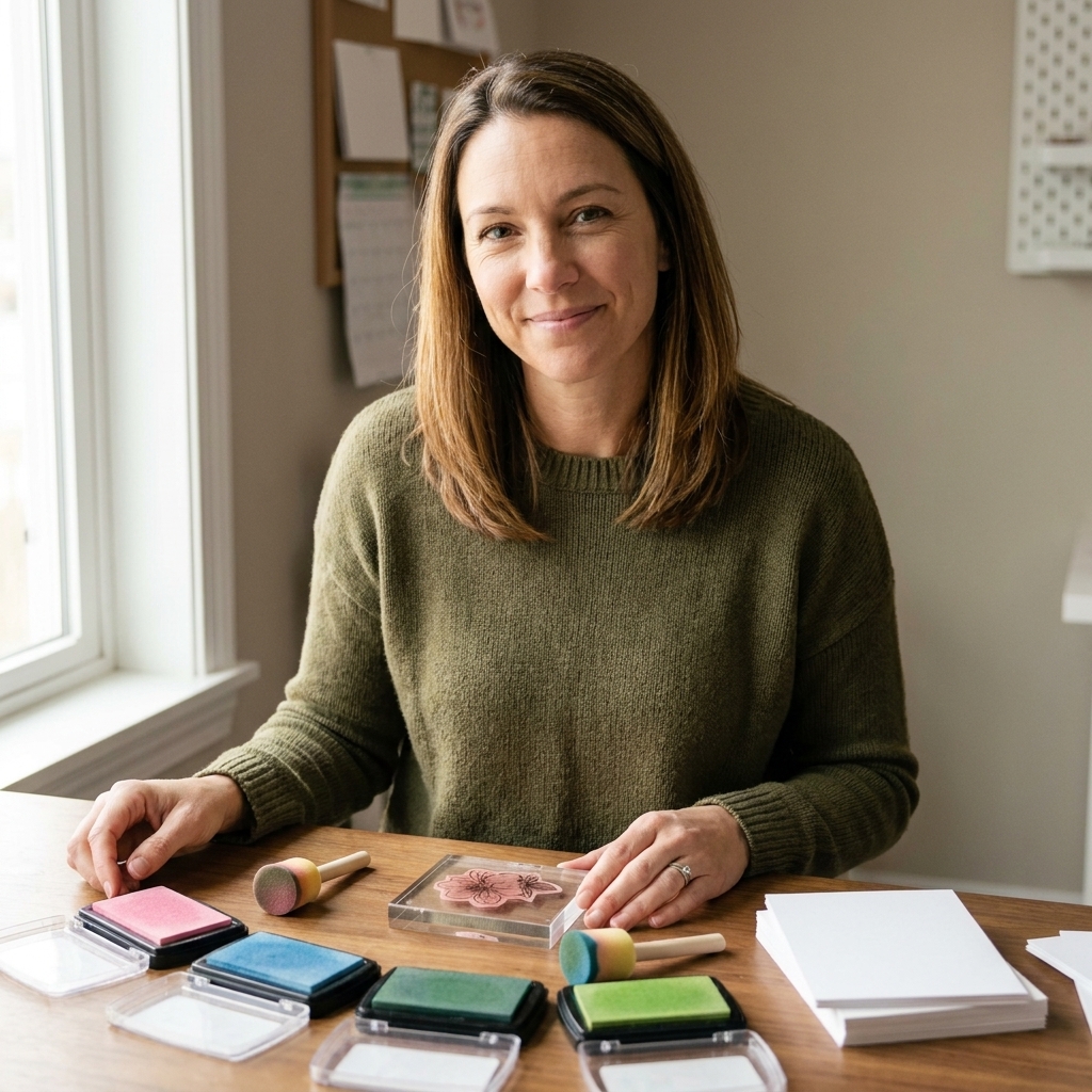
Pick inks that blend well
You will get the smoothest gradients when your colors are neighbors on the color wheel or shades in the same family. Think:
- Yellow to orange to red
- Light pink to magenta to purple
- Sky blue to teal to navy
- Light gray to charcoal (a classy monochrome ombre is stunning)
My biggest tip: choose inks from the same brand and line when possible. Ink formulas vary, and matching lines tend to blend more predictably.
Step by step
This method works on both rubber and clear stamps. The main difference is that rubber often holds ink a bit more generously, while clear stamps sometimes benefit from a stamping mat for even pressure.
1) Mount and prep your stamp
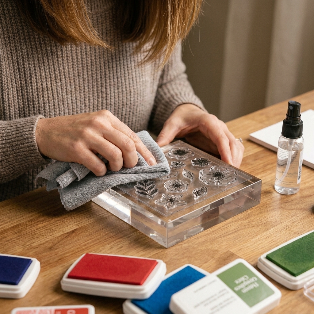
Mount the stamp on an acrylic block or in your stamp positioner. If your stamp is brand new, it may resist ink at first, especially photopolymer. The simplest fix is to stamp it a few times on scrap paper. Some crafters also like to gently clean new stamps with mild soap and water or a stamp cleaner and let them dry fully before starting.
2) Plan your gradient direction
Before you ink anything, decide where your lightest area will be. On flowers I like lighter at the top and darker at the base, but there is no wrong choice. Just pick a direction and commit so your eye reads it as intentional.
3) Start with the lightest ink
Tap the dauber lightly onto your lightest ink pad, then pounce (tap) onto the stamp where you want the light area. Do not rub hard in circles right away. Tapping gives you an even layer without pushing ink into stamp grooves.
4) Add the mid-tone and overlap
Pick up your medium shade and apply it next to the light area, leaving a small strip where the two colors meet. To blend, offload once on scrap paper (just a quick tap), then use that lighter-loaded part of the mid-tone dauber to tap into the meeting strip so the inks mingle.
5) Finish with the darkest shade
Apply the darkest ink where you want the deepest color. Again, create a small overlap where the dark meets the mid-tone. If you want drama, deepen the dark end with extra taps. If you want soft and airy, keep the dark end lighter and build slowly.
6) Soften lines with buffer tapping
This is the little move that takes an ombre from good to oh wow. With your mid-tone dauber, tap lightly across the transition areas again. The mid color acts like a bridge.
7) Stamp with steady pressure
Stamp straight down and press evenly. If you are using a stamp positioner, close the lid and apply firm, even pressure across the image. If you are stamping by hand, place your cardstock on a stamping mat, press from the center outward, and hold for 1 to 2 seconds so the ink transfers cleanly.
8) Test stamp if you are nervous
Especially with large solid stamps, a quick test on scrap paper tells you if you need more ink, more blending, or slightly different placement before you stamp your actual card panel.
One more tiny habit that helps: when you re-ink for a second try, start with light, then mid, then dark again. It keeps you from accidentally dragging dark ink into your light area. If the stamp starts looking muddy, wipe it clean and start fresh.
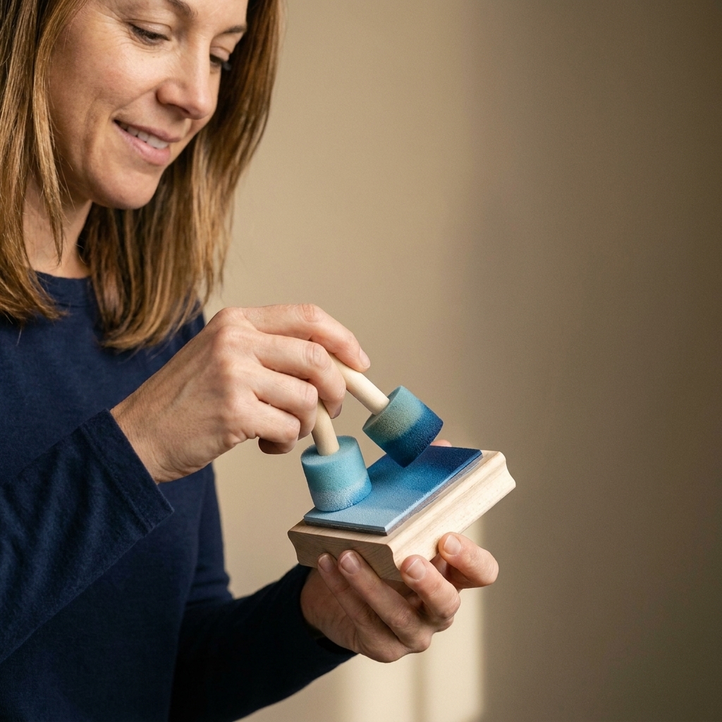
Easy blend recipes
Two-color ombre
Perfect for sentiments, simple shapes, and quick cards.
- Apply light ink to about two thirds of the stamp.
- Apply dark ink to the remaining third.
- Tap lightly in the overlap zone with the dark dauber, then soften once with the light dauber near the meeting area.
Three-color ombre
My favorite for florals and backgrounds because it looks extra “pro,” but it is still easy.
- Light at one end, dark at the other.
- Mid-tone in the center, overlapping both edges.
- Use the mid-tone dauber as your blender to soften both transitions.
Clear vs rubber stamps
Clear stamps
- Use a stamping mat for better contact, especially with solid images.
- Tap ink gently. Clear stamps can show every heavy-handed spot.
- Consider a stamp positioner so you can stamp twice if needed.
Rubber stamps
- They hold ink well, so go lighter than you think at first.
- Solid rubber images can stamp beautifully, but they also love even pressure. A mat helps here too.
Troubleshooting
Problem: harsh lines between colors
- Fix: increase your overlap zone.
- Fix: tap lightly with the mid-tone color to bridge the two shades.
- Fix: use less ink on the darker dauber and build in layers.
Problem: blotchy spots or fingerprints of ink
- Fix: switch from rubbing to tapping.
- Fix: offload once on scrap paper before touching the stamp if your dauber is too juicy.
- Fix: make sure your stamp is clean and dry before starting.
Problem: patchy coverage when stamped
- Fix: use a stamping mat and press evenly.
- Fix: re-ink and stamp again in the same spot using a stamp positioner.
- Fix: for large solids, add a little more ink overall. Ombre needs enough ink to transfer cleanly.
Problem: muddy colors
- Fix: choose colors closer together in the same family.
- Fix: keep your daubers dedicated. A dauber that has dark navy living in it will absolutely bully your pale sky blue.
- Fix: reduce how much you overlap, especially with complementary colors.
Problem: the stamp sticks or pulls paper fibers
- Fix: stamp on smooth cardstock and avoid overly fibrous paper.
- Fix: lift straight up, slowly and evenly.
- Fix: if ink is very wet, give it a few seconds before moving the paper.
Great stamps for ombre
Almost any stamp can work, but these styles give you that satisfying “yes, I nailed it” result fast:
- Large sentiments in a bold font
- Solid hearts, stars, balloons
- Floral silhouettes like leaves, branches, or big blooms
- Background stamps with repeating shapes (think dots, waves, geometric patterns)
- Layering stamps where ombre becomes the base layer for extra depth
Simple variations
Reverse ombre
Place the darkest ink in the center of the stamp and fade outward to a lighter shade. This looks amazing on big sentiments and medallion style images.
Ombre plus embossing
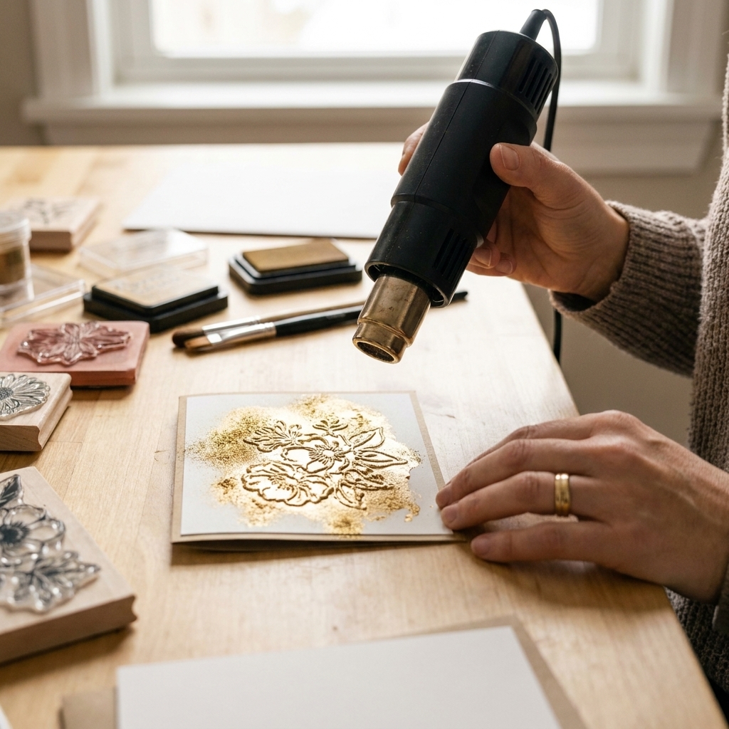
This can be gorgeous, and it can also be a little brand-dependent, so test first. One reliable approach is to create your ombre with dye inks, then clean and dry the stamp and re-stamp with embossing ink in a stamp positioner, and heat emboss with clear powder. If you prefer doing it in one go, keep dye ink away from your embossing pad to avoid contaminating it, and know that some dye inks can resist or bead on top of sticky embossing ink.
Ombre with a highlight
Leave a slim strip of un-inked stamp area between colors, then gently tap the lightest ink over it. It creates a soft highlight that reads like shine.
Dauber care tips
Sponge daubers are tiny workhorses, and a little care keeps them behaving.
- Store by color family: warm, cool, neutrals. It reduces accidental muddy blending.
- Clean when switching families: wipe on a damp cloth and then dry pounce on scrap paper, or use a gentle stamp cleaner on the sponge.
- Replace when they get crusty: if the sponge turns hard, it will stamp blotchy.
FAQ
Do I ink the stamp with ink pads or only with daubers?
For ombre, I prefer daubers because you can place color with precision and blend gradually. You can ink directly with pads for a quick two-tone look, but daubers give you the smoothest transitions.
Which ink is best for ombre stamping?
Dye ink is the easiest to blend and dries relatively quickly. Pigment ink can work, but it stays wetter and may blur if you are heavy-handed. Hybrid inks can go either way, so a small test stamp is your best friend.
Can I do ombre stamping without a stamp positioner?
Yes. A positioner just gives you a safety net for re-stamping if coverage is uneven. If you stamp by hand, use a stamping mat and press evenly.
Why does my clear stamp stamp unevenly with ombre?
Usually it is pressure and surface. Clear stamps love a little cushion under your paper, and large solid images need firm, even pressure across the whole stamp.
A gentle challenge
Pick one solid stamp and three inks in the same color family. Do five practice stamps on scrap paper, changing only one thing each time: more overlap, less overlap, lighter tapping, heavier tapping, then your best guess version. By stamp number five, I promise your hands will understand the technique in a way your brain cannot learn from reading alone.
And if your first try looks a little wonky, keep it anyway. A handmade card is still a hug folded in half, even when the ombre is learning right along with you.