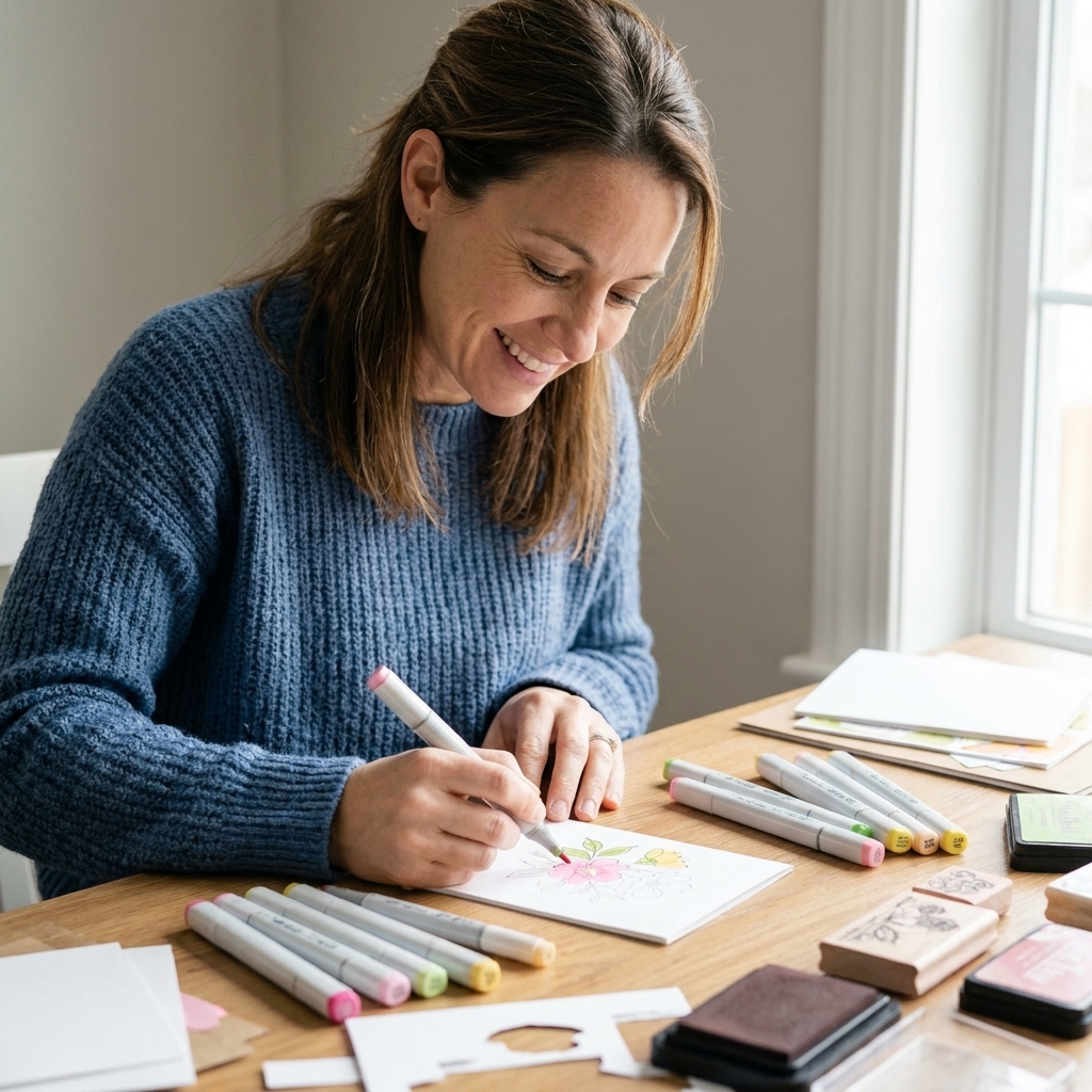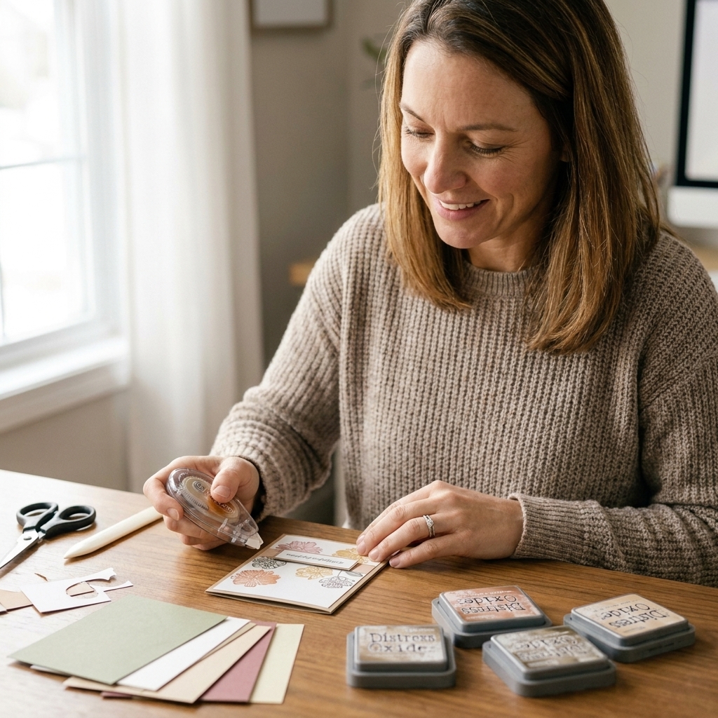
If you have ever stamped a gorgeous multi-step flower and thought, “Why does it look like it needs glasses?”, you are in the right place. Layering stamps are pure magic because they build highlights, shadows, and detail in separate impressions. But that magic depends on one thing: alignment.
I learned layering stamps the same way I learned most paper crafting things, at the kitchen table, with a pile of cardstock scraps and a lot of enthusiastic trial and error. The good news is this: once your setup is solid and your stamping order makes sense, lining up two, three, and even four-step sets becomes a calm, repeatable process.
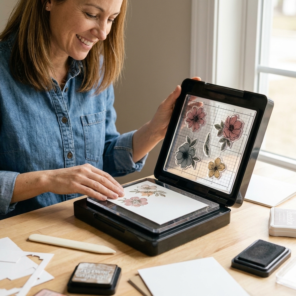
How layering stamps line up
Most multi-step stamp sets are intentionally engineered to help you align them, even when the artwork is intricate. Knowing what to look for takes away so much stress.
Common alignment cues
- Registration shapes: Tiny notches, dots, or corners built into the stamp artwork. Sometimes they're subtle, like a small flat edge on a leaf.
- Shared outlines: The base layer often forms a soft silhouette. Detail layers tuck inside that silhouette.
- Natural landmarks: Veins on leaves, petal tips, berry clusters, or the dip between petals are your best friends.
If a set has a printed layering guide, keep it nearby. If it doesn't, you can make your own in about five minutes, and I'll show you how.
Tools that make alignment easier
You can line up layers with an acrylic block, but if you want consistently crisp results, a few tools will do the heavy lifting.
A stamping platform (my top pick)
A platform lets you stamp the same spot repeatedly without shifting paper or guessing where your block will land. It's especially helpful for:
- Re-stamping a layer that came out too light
- Keeping 3 to 4 layers nicely registered
- Batch-making cards where each panel needs to match
Grid paper or a gridded mat
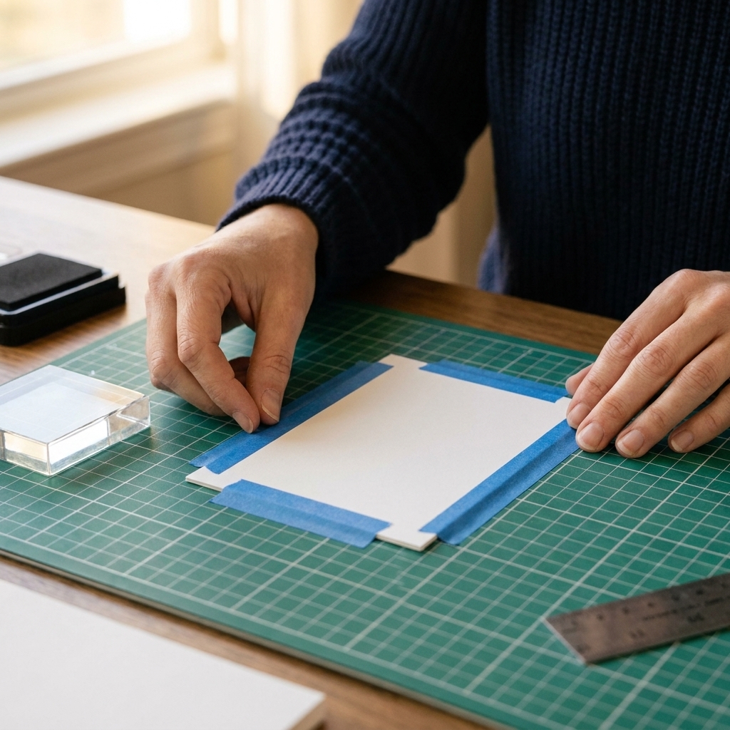
Even if you aren't measuring anything, a grid gives your eyes reference points. I like to slide a piece of grid paper under my cardstock when I'm working with a clear platform.
Low-tack tape or magnets
Hold your cardstock still. Any shifting between layers will read as "off" immediately. If you're using a platform with magnets, use them. If not, washi tape on two edges works beautifully.
Stamping aids (optional but lovely)
- Stamp positioners: Great for acrylic-block stampers.
- Sticky mat: Keeps small die-cuts and tiny panels from scooting.
- Fine-tip marker: For making tiny alignment notes on acetate or a template.
My step-by-step method
This is the exact routine I use when I want layering that looks clean, intentional, and dimensional. Once you do it a couple times, it becomes second nature.
Step 1: Start light and simple
In most stamp sets, the first layer is the base shape. It's usually:
- More open and simplified (in the best way)
- Lighter in color
- Less detailed than the later layers
Stamp this first in your lightest ink. It's much easier to tuck darker detail into a light base than to try to soften a too-dark base later.
Step 2: Do a quick test stamp
Before you commit to your card front, do one full layered image on scrap cardstock. This helps you confirm:
- The correct layer order (some sets can be sneaky)
- Which direction the stamp needs to face
- Your color choices
Keep that test piece. It becomes your visual map.
Step 3: Anchor the paper, then close the lid
In a stamping platform, I like to position my cardstock where I want the finished image, tape or magnet it down, and only then place the stamp.
- Place cardstock and secure it.
- Lay the stamp (cling side down) where you want the impression.
- Close the platform lid to pick up the stamp.
- Ink and stamp.
Step 4: Align each layer using one landmark
Instead of trying to match the entire image at once, choose one landmark and align around it. Examples:
- A single petal tip
- The inner curve of a leaf
- The top edge of a berry
- The center of a flower where petals meet
Once that one point is right, the rest of the layer usually falls into place.
Step 5: Stamp with steady pressure
Pressing too hard can cause the stamp to splay slightly, which makes later layers look misaligned even when your placement is right. Use firm, even pressure, then lift straight up.
Stamp type and paper matter
Two quick variables can make layering feel either easy or oddly fussy: your stamp material and your cardstock surface.
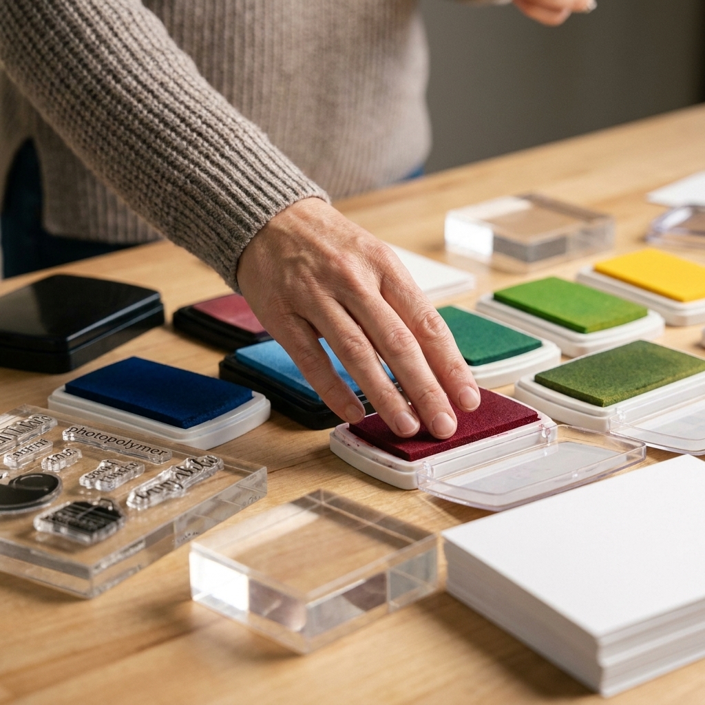
Photopolymer vs. rubber
- Clear photopolymer: It's easy to see through for alignment, but it can be more prone to splay if you press too hard. Light, even pressure helps a lot.
- Red rubber: It can feel more forgiving and stable, but you can't see through it. Rely on the platform grid, a good test stamp, and obvious landmarks.
Smooth cardstock is your friend
Layering looks crispest on smooth, untextured cardstock. Heavily textured paper can leave tiny gaps in solids and make misregistration look worse than it really is.
Color choices that hide tiny shifts
Even with great technique, some stamp sets are just a little picky. Smart ink choices can make alignment feel easier because the layers blend beautifully.
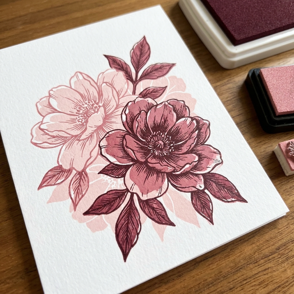
Use tone-on-tone families
Pick 2 to 4 inks that live in the same color family. For example:
- Blush pink, rose, raspberry, deep burgundy
- Soft mint, leafy green, forest green, deep olive
- Pale sky, denim, navy, deep charcoal-blue
The subtle transitions help your eye read the image as shaded, not offset.
Keep the base layer soft
A softer base impression gives you wiggle room. If the base is too dark, any tiny shift becomes more obvious. If you need to, stamp off once on scrap paper before stamping your base layer.
Ink type and dry time
- Dye inks: Crisp details and typically faster drying than pigment inks, though they can stay wet longer on coated or very smooth cardstock.
- Pigment inks: Creamy and opaque, but they can take longer to dry and may soften fine details if they're over-inked or stamped on slick paper.
- Hybrid inks: Brand-to-brand varies, but they're often a nice middle ground for layered sets.
Tips for 2, 3, and 4 layers
Two-step sets: shape + detail
Two-step stamps are usually the easiest. Get the base down, then line up the detail layer using one obvious landmark. If your detail looks slightly rotated, rotate the stamp, not the paper.
Three-step sets: let layer two lead
Layer two is often the mid-tone shading that connects the base to the crisp detail. My favorite approach:
- Layer 1: light base
- Layer 2: medium shading, focus on the center of the image
- Layer 3: darkest detail, align to edges and tips
If you nail layer two, layer three almost clicks into place.
Four-step sets: keep an order note
Four-step sets can be stunning, but they're also easy to mix up. I like a tiny sticky note on my ink stack: 1 base, 2 shading, 3 detail, 4 accents.
Also, use smaller jumps between tones. Four layers work best when each step is a gentle shift, not dramatic contrast.
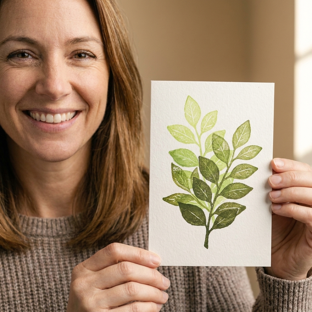
Make your own layering guide
If your stamp set didn't include a layering map, make one once and thank yourself forever.
Quick method: acetate template
- Stamp a full layered image you're happy with on scrap cardstock.
- Place a piece of clear acetate over it and tape it in place.
- Use a fine-tip permanent marker to trace a few key landmarks: petal tips, centers, leaf points.
- Label the order lightly in a corner: 1, 2, 3, 4.
Next time, you can lay the acetate over your project panel to help line up each layer before you ever ink the stamp.
Troubleshooting
Problem: the layers look doubled
- Cause: Paper shifted between layers, or you stamped twice accidentally.
- Fix: Secure the cardstock with magnets or tape. If you're on an acrylic block, try a stamp positioner or a sticky mat. Also check that your stamp is fully adhered to the block or platform lid and isn't sliding.
Problem: the image looks rotated
- Cause: The stamp is turned slightly on the block or platform lid.
- Fix: Use the grid to square the stamp placement. Align one straight portion of the stamp to a grid line, even if the stamp is organic. A tiny rotation is the number one culprit in "why does this look weird?" moments.
Problem: fine details don't land where they should
- Cause: Too much pressure or too much ink, causing the stamp to spread.
- Fix: Use less ink, especially on solid layers. Stamp off once for a softer base. Press evenly and lift straight up.
Problem: later layers look muddy
- Cause: Ink isn't dry yet, there's leftover dark ink on the stamp, or your colors are too close in value.
- Fix: Give juicy or pigment inks a quick dry with a heat tool from a distance. Clean the stamp between layers (especially before going lighter). Increase contrast slightly between layers 2 and 3, or choose a crisper ink for the top detail.
Problem: I can't tell which stamp is which
- Cause: Similar shapes across layers, especially in floral sets.
- Fix: On the stamp backing sheet, mark the layer order with a permanent marker along the edge (tiny "1, 2, 3, 4"). If you store stamps on acetate, write the order on the acetate tab.
Advanced tricks
Use a ghost impression
Stamp the next layer once on scrap paper first (without re-inking), then stamp onto your project. That faint impression can help you see where it wants to land without committing full color immediately.
Mask for depth
Want one flower to sit in front of another? Stamp the front flower first, mask it, then stamp the background flower behind it. Layering stamps plus masking can look incredibly realistic.
Emboss the final detail layer
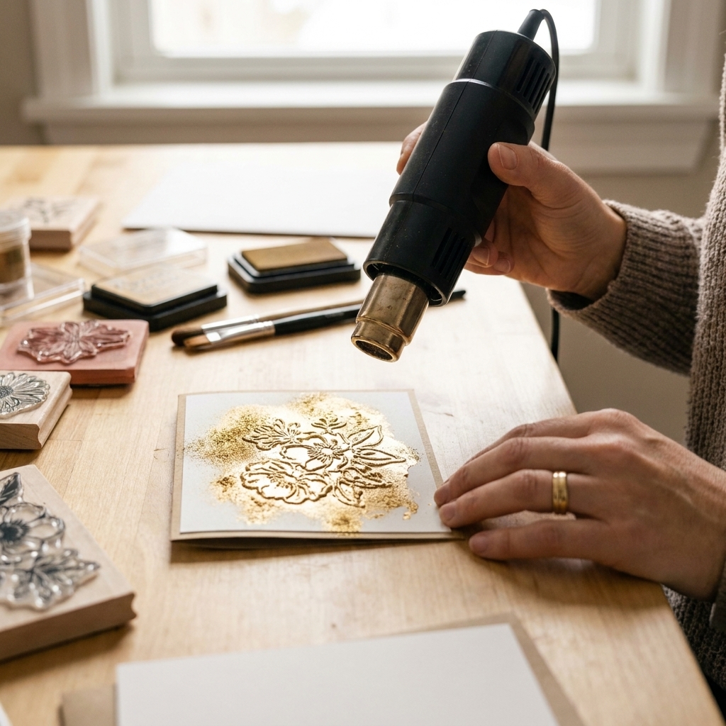
For certain images, embossing only the final detail layer in clear embossing powder makes the whole design feel sharp. If you try this, use an anti-static powder tool first and work on fully dry ink layers.
Die-cut after stamping
Stamping on a die-cut piece is possible, but it's much harder to keep it from shifting. I prefer to stamp on a larger panel, then die-cut the finished layered image.
A quick practice routine
If layering stamps intimidate you, try this mini-practice session. It's low pressure and genuinely helpful.
- Choose one small image (a single flower or leaf).
- Pick three inks in the same color family.
- Stamp the same image five times in a row on scrap cardstock.
- On each one, change only one thing: pressure, ink amount, or how you align (landmark choice).
By the fifth try, your hands will get it, and your eyes will start spotting alignment cues automatically. That's when layering stamps go from frustrating to addictive.
Quick FAQ
Should I stamp light to dark or dark to light?
Most of the time, light to dark is the easiest path. That said, always check the set's official layering guide if it has one. Some designs want a darker outline first, or a crisp embossed outline first, with color layers tucked underneath.
Do I need a stamping platform?
No, but it makes multi-step stamping much more consistent. If you love layering stamps, a platform is absolutely worth it.
Why does my layering look off even when I line it up?
Check for stamp splay (too much pressure), paper shifting, or a tiny rotation in the stamp placement. Rotation is sneaky and common.
Can I mix brands within a layered image?
For inks, yes. For stamp layers, it's trickier. Layered sets are designed as a matched system, so mixing different stamp sets rarely aligns perfectly.
One last pep talk
If your first few layered images are a little quirky, welcome to the club. Layering stamps have a learning curve, but it's a friendly one. Start with a simple two-step set, use a platform if you've got one, and focus on one landmark at a time. And remember, a handmade card is still a hug folded in half, even if the flower is slightly excited and leaning to the left.