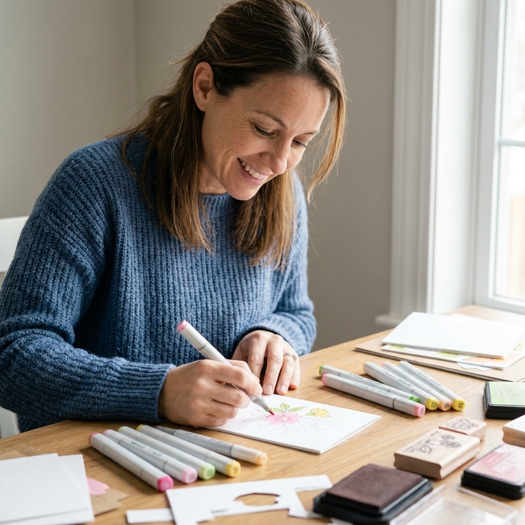
If you have ever looked at a colored stamped image and thought, “How on earth does it look like it was painted freehand?” you are going to love no-line stamping. It is the same cozy routine we already know and love (stamp first, color second), except the stamped outline is so light it disappears as you shade. The result is soft, dreamy, and honestly a little magical.
What it is
No-line stamping simply means you stamp your image in a very pale ink, then color over it until the stamped lines fade into the shading. Instead of a bold black outline, you get gentle edges and natural shadows, like a hand-painted illustration.
Supplies you need
You do not need a giant shopping list, but a few choices make a big difference.
- Stamps with clear shapes: Florals, critters, and images with distinct sections (petals, leaves, clothing) are the easiest to start with.
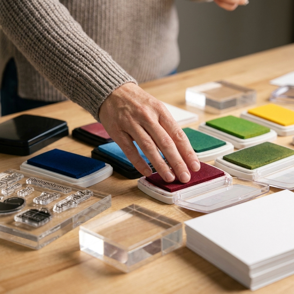
- A pale ink: The whole trick is picking something light enough to disappear, but still visible while you color.
- Stamping tool (optional, but helpful): A platform makes it easier to re-stamp if the first impression is too light.
- Your coloring medium: Alcohol markers, watercolor, or colored pencils all work, just with different techniques.
- Good cardstock: Marker-friendly cardstock for alcohol markers, watercolor paper for watercolor, and a smooth, sturdy cardstock for pencils.
Best inks to use
The ink you choose is the make-or-break moment. You want something that gives you a whisper of a guide without leaving a permanent outline. Results can vary by ink, paper, and coloring medium, so a quick test is always worth it.
- Dedicated fade-out ink: These are designed for no-line stamping and often fade under coloring, especially with alcohol markers. Some combinations can still show through with very light blends or with pencils, so test first.
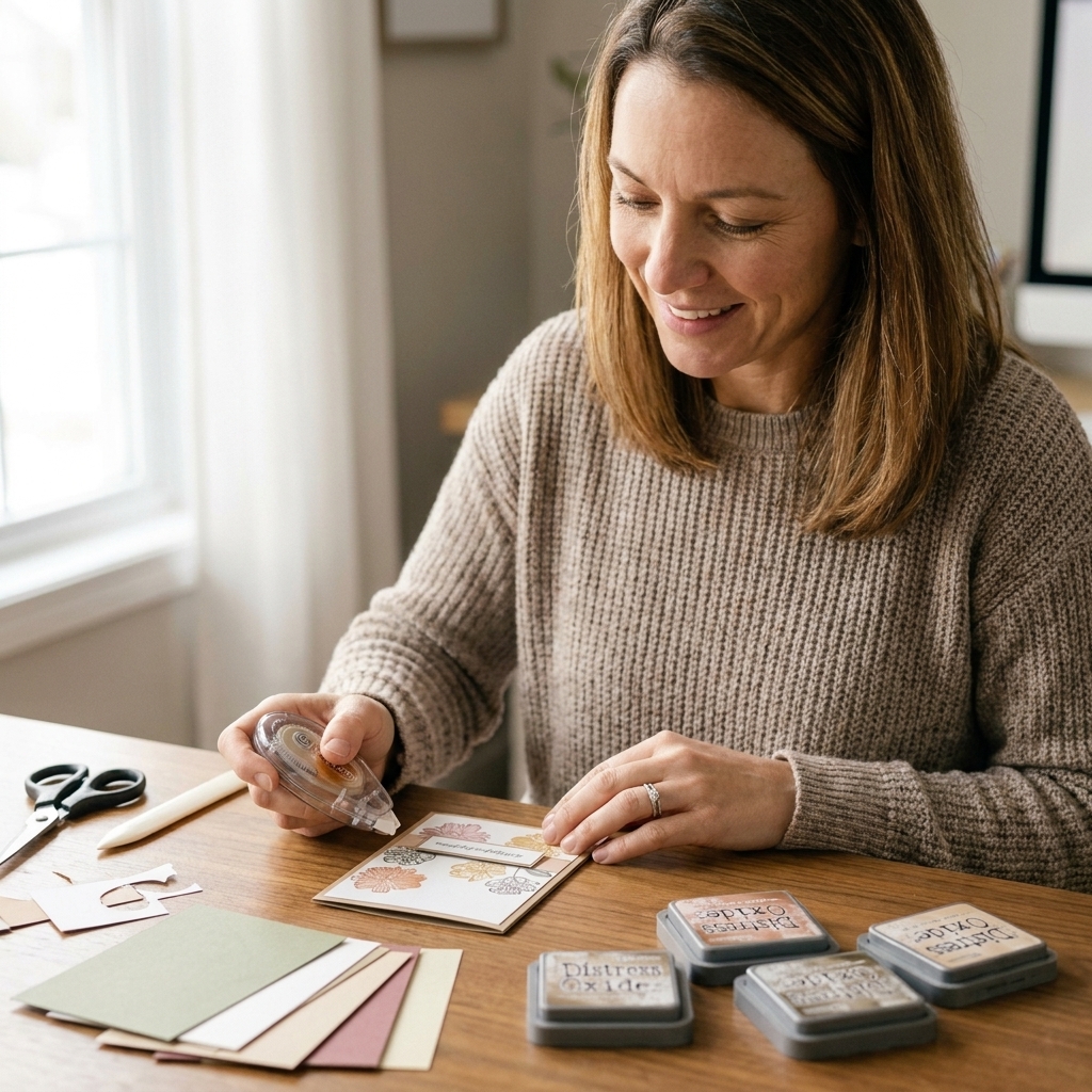
- Distress Ink in a light shade: A popular beginner-friendly option is Antique Linen. It stamps softly and often blends away as you color, but it can remain visible on some papers or shift slightly under certain marker techniques, so do a small swatch test.
- Very light dye inks: Pale beige, light gray, or soft pink inks can work well. Try to avoid anything too saturated, since it can peek through even after shading.
Quick tip: Stamp on a scrap with your chosen medium. If you can still clearly see the outline after a little shading, go lighter with ink, stamp off once on scrap paper before stamping your project, or choose a paler color.
Ink and marker smudging
Alcohol markers can re-wet many dye inks, which leads to smearing. If you notice your outline dragging into your coloring, swap inks and test again. Some crafters find that certain dye inks smear easily with alcohol markers, while many hybrid or alcohol-marker-friendly inks hold up better. If you are unsure, let your stamping dry longer, heat set if your ink allows it, and always test the exact combo you plan to use.
Best coloring mediums
No-line stamping works with several mediums, so use what you love. Here is what to expect.
- Alcohol markers: Probably the most popular pairing. Markers build smooth gradients that naturally cover the pale stamped lines. Choose an ink that will not smear with alcohol, and use marker-friendly cardstock to reduce feathering.
- Colored pencils: Great for control and texture. Pencils take longer to fully cover stamp lines, but you can blend them into soft edges beautifully.
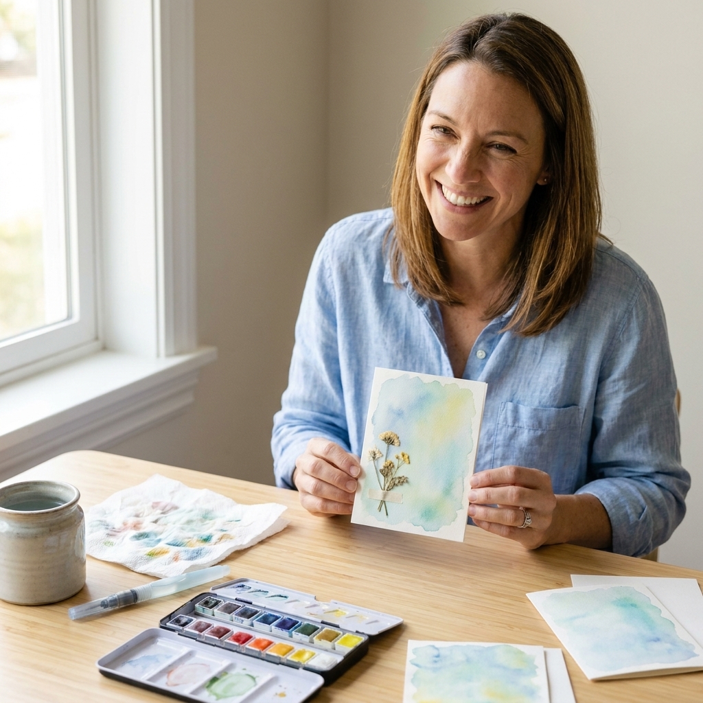
- Watercolor: Gorgeous results, especially for florals. Use watercolor paper to prevent buckling, and test your ink first since water can reactivate and move some inks.
Paper and medium matchups
Most no-line “mystery problems” are really paper and medium problems. A few quick guidelines make everything smoother.
- Alcohol markers: Use marker paper or marker-friendly cardstock so your blending stays clean and you get less feathering. Expect bleed-through, so protect your work surface and do not plan to use the back of the sheet.
- Watercolor: Choose watercolor paper (cold press is beginner-friendly). If your ink reactivates, your lines can bloom or drift. That can be pretty, but if you want crisp edges, pick an ink that stays put and test before committing.
- Colored pencils: A smoother cardstock makes it easier to build layers and cover any remaining stamp lines. If the paper is too toothy, you may need more layers to get the soft, painted look.
How to do it
- Stamp lightly. Ink your stamp, then stamp once on scrap paper to “stamp off” before stamping your cardstock. This gives you a lighter impression without changing inks.
- Start with light coloring. Begin with your lightest shades to map out where everything goes. This is where the pale stamp impression is your best friend.
- Pick a light source. Choose where your light is coming from (top left is an easy default) and keep the highlight areas lighter.
- Add shadows gradually. Build depth with mid-tones, then deepen shadows in the tucked-away spots (behind petals, under chins, inside folds).
- Create edges with shading. Since you are not relying on a black outline, use a slightly darker value at the edge where one part overlaps another. That shadow becomes the “line.”
- Finish with details. Add the darkest accents sparingly, then step back. If you add too many dark areas, you can lose the soft no-line look.
Shading tips
- Work one section at a time: Color one petal, one leaf, one sleeve, then move on. It keeps you from getting lost.
- Use contrast on overlaps: If two shapes are touching and blending together, darken the one that is behind with a shadow where they meet.
- Keep a reference nearby: Even a quick photo of a real flower or a simple coloring reference can help you decide where shadows go.
- Do not be afraid of the “ugly stage”: In the middle, it can look flat or messy. Depth usually shows up in the last third of your shading.
Practice plan
If you want a low-pressure way to get comfortable fast, try this:
- Pick one simple stamp: A single flower or a small critter is perfect.
- Make a tiny value cheat sheet: Scribble your light, mid, and dark shades on a scrap so you can see your range.
- Do three quick attempts: First one is just learning the shapes, second one pushes shadows a bit darker, third one focuses on overlap shadows. You will be shocked how much you improve by round three.
Troubleshooting
- My lines are too dark: Stamp off once (or twice) before stamping your project, switch to a paler ink, or try a dedicated fade-out ink.
- The ink smears with markers: Many dye inks can smear when hit with alcohol markers. Let the stamping dry longer, try a different ink, and always test your ink, paper, and marker combo before starting your final piece.
- I cannot tell where shapes end: Add a light base layer everywhere, then use gentle shadows where pieces overlap. This is the fastest way to separate petals, leaves, and limbs.
- It looks flat: Increase your value range. Add one darker shade than you think you need, but keep it concentrated in small shadow areas.
- My watercolor paper is warping: Use heavier watercolor paper, tape down your panel, and keep your first washes lighter. Excess water is usually the culprit.
Easy images to start with
If you are new to no-line stamping, start with:
- Simple flowers with big petals
- Leaves and greenery
- Animals with clear facial features
- Images with fewer tiny details
Once you are comfortable, you can move on to layered bouquets, scenes, and intricate stamps.