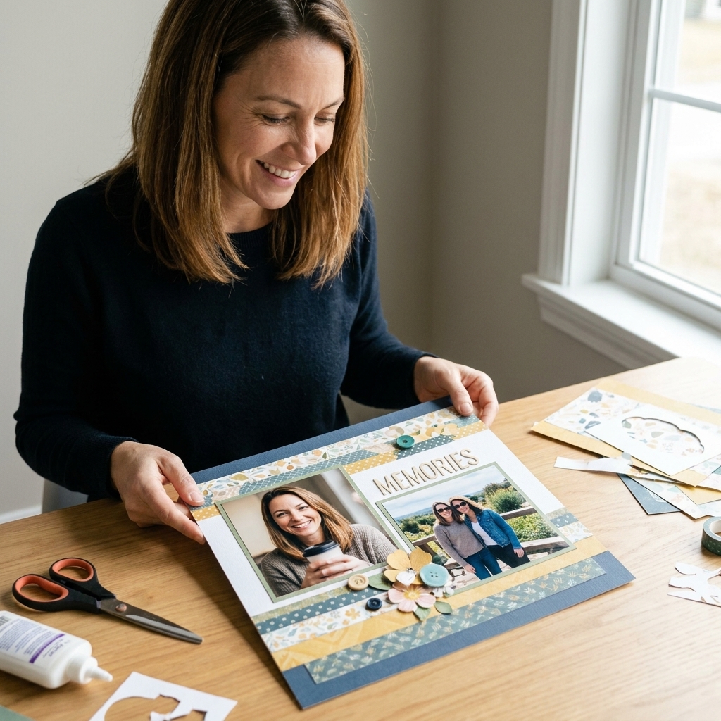
If you have ever finished a gorgeous 12x12 page and then tried to make a “matching” second page, you know the struggle. One side ends up doing all the talking, the other looks like it showed up late, and the center seam feels like a brick wall. A double-page spread should feel like one big, cozy story, just folded into two protectors.
Let’s walk through the design tricks I use at my craft table to make two pages read as a single, seamless layout. No formal art degree required, just a little planning, a few paper-hoarder shortcuts, and the willingness to shuffle things around before you commit with adhesive.
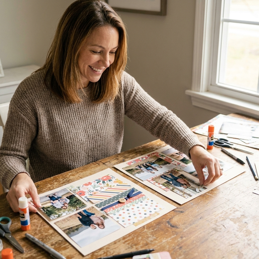
Think in one canvas, not two pages
The biggest mindset shift is this: you are not designing a left page and a right page. You are designing one 24-inch wide scene that just happens to have a seam in the middle.
Start with a quick “spread map”
Before you cut anything fancy, sketch two squares and mark the center join. Then decide three things:
- Your story in one sentence. “Pumpkin patch Saturday,” “first day of school,” “beach weekend,” and so on.
- Your main focal area. Where do you want the eye to land first, left, right, or slightly off-center?
- Your movement direction. Will the eye travel left to right like reading, or swirl in a loop?
When you know those three, every choice after that gets easier.
Master the center gutter (the seam is not the enemy)
The center gutter is the space where your album divides the spread. It is the most common reason a double page feels disconnected. The goal is to bridge the join without creating bulky bumps that make your protector ripple.
Design rules for the join
- Avoid thick stacks right on the seam. Puffy stickers, chipboard, and layered clusters are happiest at least 1 inch away from the center.
- Let flat elements cross the seam. A thin strip of patterned paper, a washi run, a long title, a printed border, or a line of tiny enamel dots (kept mostly flat) can visually connect the pages.
- Repeat something on both sides. Same paper, same shape, same ink color, same stitch line. Repetition is your best glue.
My favorite “invisible bridge” trick
Cut a strip of patterned paper about 1 to 2 inches tall and long enough to span both pages. Place it so it crosses the center. Then cut it exactly at the seam and adhere each half to its own page. When the pages sit side by side, it reads as one continuous strip, but it behaves like two separate pages in the album.
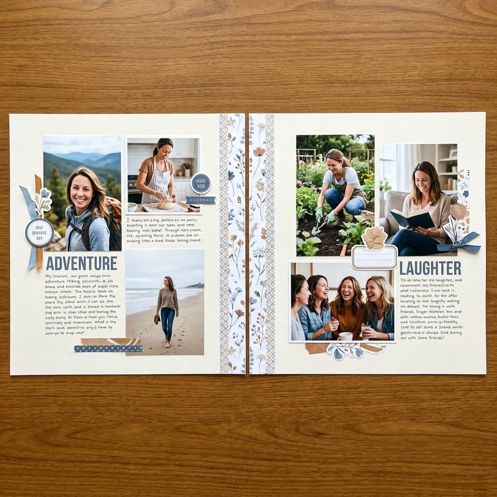
Pick a focal point and give it helpers
A seamless spread usually has one clear hero moment and supporting details that echo it. Without a focal point, your eye bounces around like a pinball and the spread feels busy even if it is technically coordinated.
Easy focal point options
- One large photo on one side, with smaller photos on the other.
- A photo grid that spans both pages, like 3 photos left and 3 photos right, treated as one unit.
- A title cluster that is big enough to anchor the whole spread, often near the middle but not directly on the seam.
“Triangle design” for instant flow
Place three visual “stops” across the spread, forming a gentle triangle: a main cluster, a smaller cluster, and a tiny accent cluster. Use similar colors or shapes so your eye naturally travels between them.
Use photo placement to create movement
Photos are not just memories, they are your strongest design shapes. Their size and spacing can either connect your pages or split them apart.
Photo strategies that make two pages feel like one
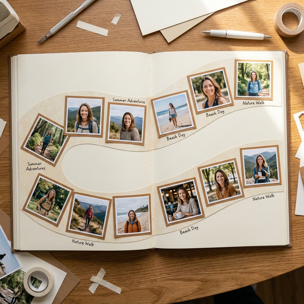
- Staggered photo line: Align photos in a loose row that runs across both pages, with slight up and down variation.
- Shared baseline: Keep the bottoms of key photos aligned across the seam for a calm, organized look.
- Panorama on purpose: If you have a wide scene, print it as a panorama and split it across two pages. Use thin cardstock mats to keep the seam tidy and avoid thick layers.
If your photos are different sizes, unify them with consistent matting. Even a skinny 1/8-inch mat around each photo can make a mixed set look intentional.
Color and pattern: repeat, echo, breathe
Color is the fastest way to make a spread feel cohesive. Pattern is the fastest way to make it feel chaotic. We want both, but in a balanced way.
A simple palette that always works
Try the 3-2-1 approach:
- 3 neutrals: white, cream, kraft, gray, black.
- 2 main colors: pulled from your photos.
- 1 accent: something punchy like teal, coral, gold, or a bright red.
Then repeat those colors on both pages through small items: enamel dots, journaling ink, tiny banner tails, thread, or stamped accents.
Patterned paper without the overwhelm
- Pick one “star” pattern for the spread and use it in two places, one on each page.
- Use quieter patterns (small tone-on-tone dots, subtle grid, tiny florals) as your supporting cast.
- Give your eyes resting space with solid cardstock or vellum. Negative space is not empty, it is breathing room.
Titles that bridge the story
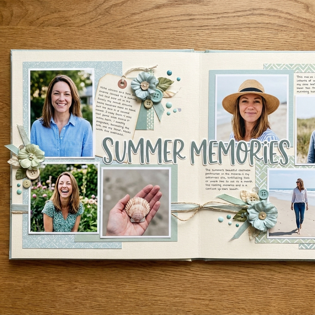
If you want instant unity, let your title do some heavy lifting. A spread title that spans both pages can make the whole layout read like a single headline.
Title placement ideas
- Across the top: Great for travel, holidays, and event spreads.
- Straddling the middle: Place the first word near the end of the left page and the rest on the right, keeping everything flat and seam-safe.
- Stacked title block: A title cluster on one page, echoed by a smaller subtitle or date cluster on the other.
Pro tip from someone who has re-lettered a title more times than I care to admit: lay your letters down with low-tack tape first. Stand up, squint, and make sure it reads smoothly before you commit.
Journaling that feels integrated (not tacked on)
Journaling is the heart, but it is also a design element. When it is placed thoughtfully, it helps guide the eye across the spread.
Ways to make journaling support flow
- Place journaling near the focal photo to anchor the story.
- Use a journaling strip that visually points toward the other page.
- Split journaling into two short blocks, one on each page, using the same cardstock, pen color, and corner treatment.
If writing feels intimidating, start with 3 sentences: what you did, who was there, and one tiny detail you never want to forget (the weather, the joke, the snack, the song in the car).
Embellishments: clusters with purpose
Embellishments are the sprinkles, but even sprinkles need a plan. The secret is to cluster them in a way that supports your focal point and repeats across the spread.
Cluster recipe (works on nearly any theme)
- One medium piece: a die-cut, label, or small tag.
- One small piece: a tiny icon, heart, star, or mini phrase.
- One texture: twine, stitching, a staple, or a small vellum layer.
Create one main cluster near the focal area, then echo a smaller version on the other page using at least one matching element. That echo is what makes the spread feel intentional.
And yes, I am going to say it: step away from the thick foam tape near the seam. Your page protectors will thank you.
Consistency tricks that read as “seamless”
When something feels off and you cannot put your finger on it, it is usually a consistency issue. These are the little details that quietly pull everything together.
- Use the same corner style: all square corners or all rounded corners for photo mats.
- Repeat the same “line weight”: thin black pen doodles, a stitched border, or a repeated stamped line.
- Keep spacing consistent: even gaps between photos and mats look polished.
- Limit font styles: one handwritten style plus one printed font is plenty.
Step-by-step: build a double-page spread that flows
- Choose your photos and pick one hero photo or hero moment.
- Pull your palette from the photos (2 main colors plus neutrals).
- Create a base plan by placing plain cardstock or foundation paper on both pages.
- Arrange photos first across both pages before gluing anything.
- Add your bridge element (strip, long title, or continuous border) and make sure it avoids bulk at the seam.
- Place journaling to support the focal area and guide the eye.
- Add clusters in a triangle across the spread, repeating at least one embellishment type.
- Check the seam by sliding the pages slightly apart and back together. Nothing should look awkward when the album shifts.
- Commit with adhesive starting with big, flat layers, then photos, then embellishments.
Common double-spread problems (and quick fixes)
“My pages match, but they do not connect.”
Add a repeated element that appears on both sides: a strip of the same patterned paper, the same label shape, or a repeated stamped icon. Matching colors alone is not always enough.
“The seam looks like a hard break.”
Introduce a gentle crossing line: a banner trail, a row of small stars, a stitched line, or a title that reaches toward the other page. Keep it flat and slightly away from the join.
“One side feels heavier.”
Balance visual weight with either a darker paper on the lighter side, a larger photo, or a second cluster. You do not need symmetry, just similar “heaviness.”
“It looks busy and I cannot rest my eyes.”
Pull back one patterned paper and replace it with a solid. Then reduce embellishments by about 20 percent. Busy spreads often become beautiful once you let the photos breathe.
FAQ
Should both pages use the same background paper?
Not always, but it helps. If you use different backgrounds, repeat at least two elements across both pages (like the same mat color and the same accent pattern) so they still feel like siblings.
How many photos work best on a double-page spread?
Anywhere from 3 to 10 is common, but the real key is grouping. A cluster of small photos reads as one unit, especially if you use consistent mats and spacing.
Can I put interactive elements on a double-page spread?
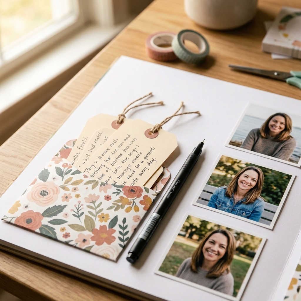
Absolutely. Place flip-ups and pockets away from the seam and try to keep them mostly on the outer edges so the album can close comfortably.
What adhesive keeps large spreads from warping?
For big foundation layers, I like a strong tape runner plus a few strategic dots of liquid glue for long-term hold. If you use wet glue, apply thinly and burnish well to prevent rippling.
A final pep talk from my paper pile
The magic of a double-page spread is that it lets your story stretch out and breathe. Give yourself permission to audition pieces before gluing, take a quick photo of your layout-in-progress (so you can come back if you second-guess), and remember that the seam is just a join, not a stop sign.
If you try one thing from this post, make it this: add one intentional bridge element and repeat it on both pages. That tiny design choice is the difference between “two nice pages” and “one stunning spread.”